Civilization VII's Deluxe Edition debuted recently, and online discussions about its user interface (UI) are already intense. But is the criticism justified? This analysis dissects Civ 7's UI to determine if it's as flawed as many claim.
← Return to Sid Meier's Civilization VII main article
Is Civ 7's UI as Bad as They Say?
Early access players of the Deluxe and Founder's Editions are already voicing concerns, primarily targeting the UI and missing quality-of-life features. However, a balanced assessment is needed before accepting the widespread negativity. We'll evaluate the UI element by element, comparing it to the standards of effective 4X game interfaces.
Defining a Successful 4X UI
While some argue for objective 4X UI design principles, the reality is more complex. A UI's effectiveness depends on the game's style and goals. However, common elements of successful 4X UIs consistently emerge from design studies. Let's use these benchmarks to analyze Civ 7.
Information Hierarchy
A clear information hierarchy prioritizes accessibility and relevance. Essential resources and mechanics should be prominent, while less crucial elements should be easily accessible. The UI shouldn't display everything at once, but organize information logically.
Against the Storm's building menus exemplify this. Right-clicking a building reveals a multi-tab menu, prioritizing common actions in the default tab and placing less frequent functions in subsequent tabs.
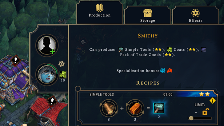
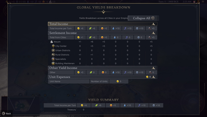
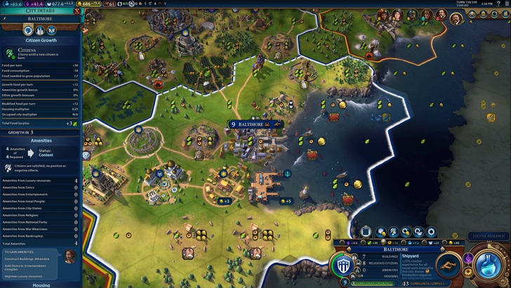
Civ 7's resource summary menu, while functional, lacks depth. It displays resource allocation but lacks specific district or hex-level detail for resource generation. Expense breakdowns are also limited. It's usable but could benefit from increased granularity.
Visual Indicators
Effective visual indicators (icons, colors, overlays) convey information quickly. A good UI uses these to communicate data without relying heavily on text.
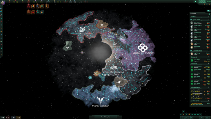
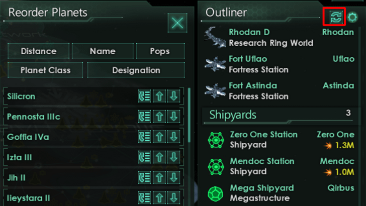
Stellaris, despite overall UI criticism, uses visual indicators well in its Outliner. Icons clearly show ship status and colony needs.
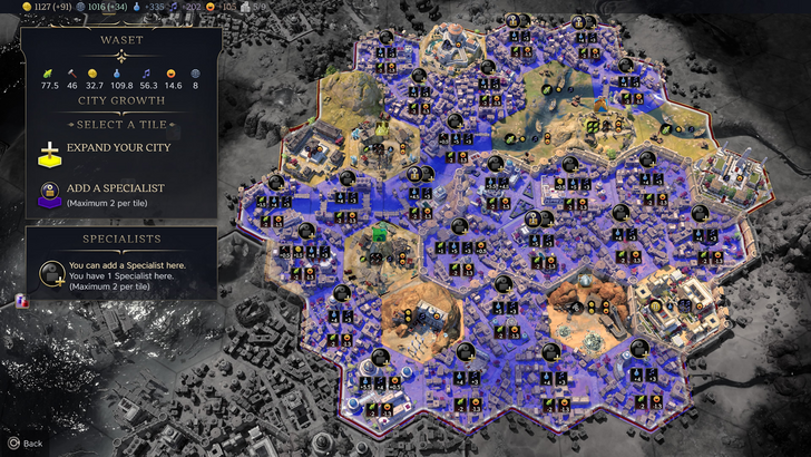
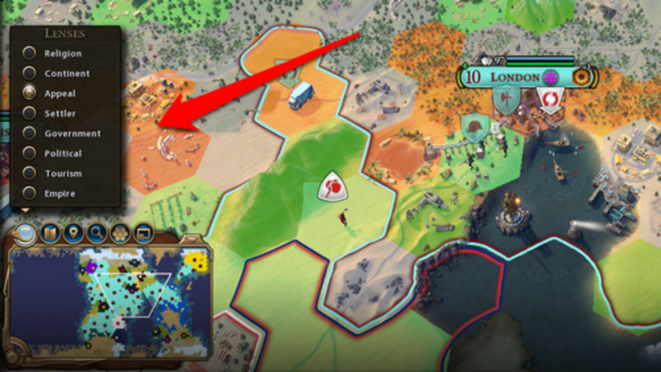
Civ 7 uses iconography and numerical data. Tile yield overlays, settlement overlays, and the settlement expansion screen are effective. However, the absence of certain lenses from Civ 6 (appeal, tourism, loyalty) and customizable map pins are significant drawbacks.
Search, Filtering, and Sorting
Search, filtering, and sorting become crucial in complex 4X games. These features manage information overload.
Civ 6's powerful search function allows for easy location of resources, units, and features. Its Civilopedia links seamlessly to in-game elements.
Civ 7 lacks this crucial search function, a significant usability issue. This omission is a major drawback, impacting navigation and potentially hindering gameplay.
Design and Visual Consistency
UI aesthetics and cohesiveness are vital. A poorly designed UI can negatively impact the overall player experience.
Civ 6's dynamic, cartographical style integrates seamlessly with the game's aesthetic.
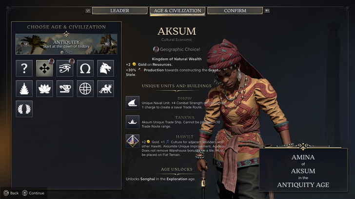
Civ 7 adopts a minimalist, sleek design. While not unattractive, its subtle thematic direction lacks the immediate clarity of Civ 6, leading to mixed reactions. Visual design is subjective, but the less visually striking approach is a point of contention.
Conclusion: Not as Bad as Advertised
While Civ 7's UI isn't perfect, the overwhelmingly negative reception is unwarranted. The missing search function is a significant flaw, but not game-breaking. Compared to other issues, the UI's shortcomings are relatively minor. While it pales in comparison to some more visually impressive 4X UIs, its strengths should be acknowledged. With updates and player feedback, it has potential for improvement. The overall game's strengths compensate for the UI's imperfections.
← Return to Sid Meier's Civilization VII main article
Sid Meier's Civilization VII Similar Games